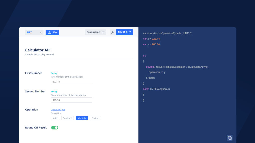
Problem
API documentation tells developers how to use a certain API. An API can have multiple endpoints. Developers read the API documentation to get an idea what does each endpoint do. To find out how these endpoints actually work they have to call those endpoints in their respective apps. Ultimately they find themselves jumping between the app and the API documentation. This wastes a lot of their time as well as focus.
Solution: Interactive API Documentation.
Provide developers with an API explorer where they can play around with all the endpoints while they are still reading API documentation. So they’ll have a clear understanding of what a specific endpoint does before diving into code.
Background
To give a little background, APIMatic is a platform which helps companies improve their developer experience by providing API documentation packed with a lot of features. So we were about to add another feature which was going to allow companies to help their developers consume their APIs.
Help developers love your API by providing them everything required to consume it.
Process
Before I could get my hand dirty with wireframes I started asking developers questions like:
1- How would you feel if you could interact with API Documentation?
2- How would you feel if you could try out endpoints while reading the API documentation?
3- Have you ever come across an interactive API documentation?
4- What comes in your mind when you hear “interactive API Documentation”?
One thing got pretty clear at this point. Developers don’t like moving back and forth between docs and their IDE.
Once I got the validation from the developer community I started studying other API Documentation tools. They all focused on all text and no interaction.
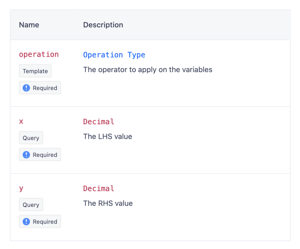
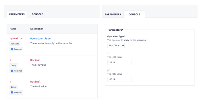
This is how content of an endpoint appears in almost all of the API Docs.
Here is an example of simple calculation endpoint from our sample “Calculator API”.
In this example “X” & “Y” are the digits and “Operation” is basically the operator that can be used/applied between both digits e.g Add, Subtract etc.
Developers can read what every endpoint does and all but to try it they’ll have to call it in their respective apps.
Next thing that I had in my mind was seamless transition. Like whatever solution I propose must not break the current flow and experience of users. To ensure that I added another tab named “Console” where same parameters were placed but with respective input fields.
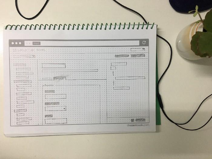
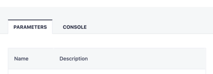
I was half way through at this point. I am saying this because filling in fields won’t take us anywhere unless we’ve a result.
APIMatic provides a 3 tier documentation. Navigation, docs and code samples. Third tier i-e code is directly tied to the endpoint. To make the documentation interactive we decided to reflect these fields to the code directly.
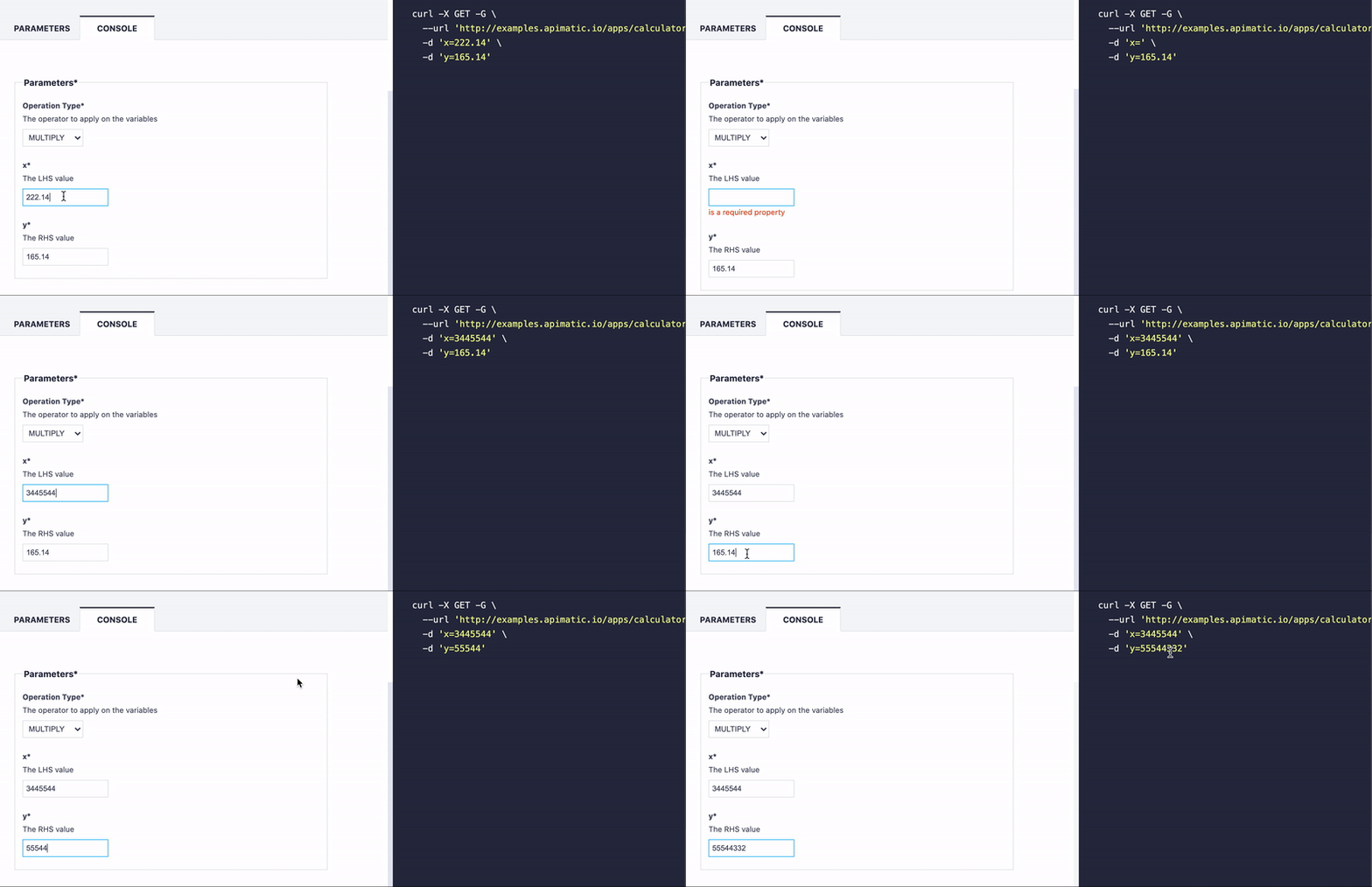
I cannot forget excitement of developers when we performed usability testing on this feature.
Moving on to testing the endpoint bit. We have the fields to add data, code samples have been tuned accordingly, now we need a trigger to basically get the end result.
Placing “TRY IT OUT” button was one last bit of the puzzle. Whether to place it in the mid tier or with the code? I went back to basics and recalled that fields were just there to feed the code while code is what developers would want to test so “TRY IT OUT” button belongs to code tier.
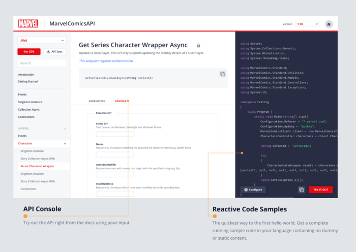
So this is how we managed to make our docs interactive with reactive code samples. View it live in action here. View its visuals here.


